Duolingo gamification: Product feature case study
Dear reader,
Welcome to my product feature case study #3. If you are looking to break into (or are already in) a product role, you will enjoy my product feature case studies. As someone who recently broke into the Product Management field, I find product case studies overwhelming with too many features being discussed at once. Product feature case studies help me learn the same concepts while focusing on one aspect at a time. If you can relate to this, consider joining me in this learning journey by following me.
In this article, I will share my insights on the gamification feature of the Duolingo app from a PM lens. I am analyzing the application in a Web Browser as I always prefer learning on my laptop. I will continue to add my observations on other features in my upcoming articles. If you haven’t already, check my last article on the Duolingo onboarding product feature case study.
Assumption: For this product feature study, I am assuming that the user has already signed up for the app.
Note: Do check the references if you want to read more about Duolingo.
Introduction
Duolingo is a free app for language learning which helps users practice vocabulary, grammar, pronunciation, and listening skills using spaced repetition.
Product feature analysis: Gamification
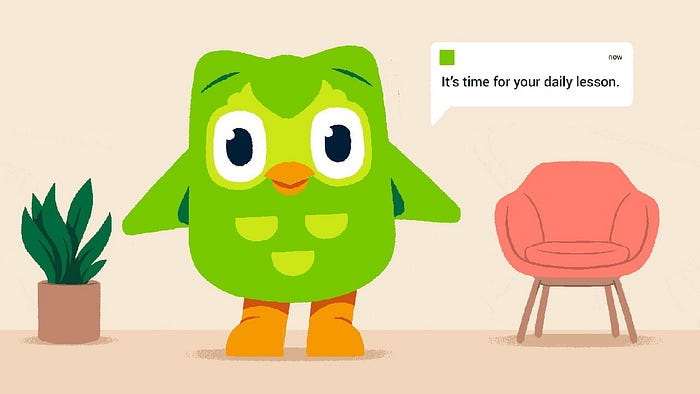
Duolingo is known for its gamification strategies. You learn a new language without feeling any pressure. You read, write, listen to different audio, and identify images for different words while earning points for each activity. You live and breathe the new language while using the app and that is exactly how your brain learns to pick patterns of an unfamiliar language.
Join me in analyzing the workflow of learning a new language on the Duolingo app. I wanted to learn Spanish.
Step 1: Lesson Overview
I was presented with the objective of my lesson and a guidebook that summarized what I could expect in the learning exercises. The user does not have to invest time in making decisions when starting to use the app as the learning path is already laid out for them.
Tips:
1. It is always a good idea to prepare the user for what’s coming.
2. Empower the users to take quick decisions without overwhelming them with too many options.

Step 2: Taking a lesson
Next, I started a lesson. I was presented with a progress bar which enabled me to get an estimate of the number of activities in a lesson and the approximate time it would take.
Tip: Use a progress bar when a workflow involves multiple steps.

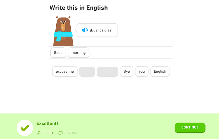
Duolingo keeps sending little nudges to the user to complete a lesson and get answers correct. I was happy to see this when I got 5 correct answers in a row (The competitive person in me wanted to complete more than one lesson that day!)

Tip: Little nudges to the user go a long way in helping the user to understand and interact with your product.
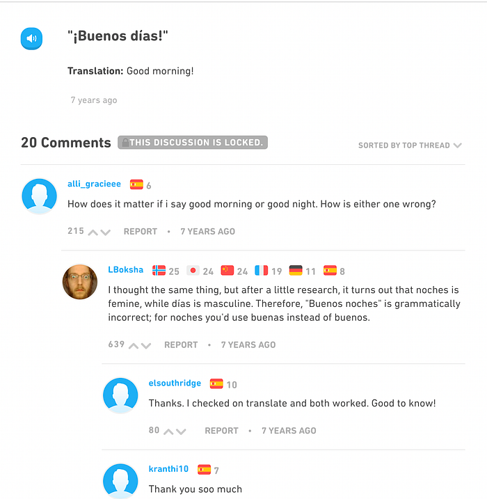
Duolingo also gives you the option to report or discuss an answer. You can report an answer if you are not satisfied with its accuracy. This is then taken as feedback and sent to the product support team for future improvements.
On the other hand, you can discuss your answers in the discussion forum with other folks learning the language to get a better understanding of the concepts.
Step 3: Reviewing your mistakes
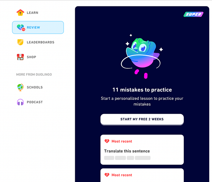
After completing a unit, I was presented with an option to review the exercises I missed. This is an effective strategy for knowledge retention.

In case the user skips these review exercises, they are available as a separate tab in the app.
Tip: Don’t expect the user to respond to every nudge. Give them the option to review the associated action items later.
Step 4: Completing a lesson
I received streak freezes on the completion of my lessons. The streak freezes allow you to miss a day of practice without losing your progress. While these are good, they might not be enough. We should assume that the user is not disciplined and give them multiple ways to redeem themselves in the learning process. This ensures that they are not demotivated to use the app.
Tip: Don’t expect the user to be disciplined. Give them the option to redeem themselves if they miss the required goals. Keep them motivated to use the app.

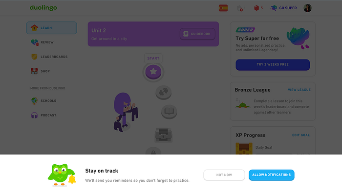
Also, while on the app, I kept getting these notifications every 5 minutes that were both annoying and distracting.
Tip: It is good to encourage the user to take certain actions but these should not come at the cost of user experience and their attention span.
This brings me to the end of my observations on the Duolingo App. Let me know what you would add by responding to this article.
Summary
- It is always a good idea to prepare the user for what’s coming.
- Empower the users to take quick decisions without overwhelming them with too many options.
- Use a progress bar when a workflow involves multiple steps.
- Little nudges to the user go a long way in helping the user to understand and interact with your product.
- Don’t expect the user to respond to every nudge. Give them the option to review the associated action items later.
- Don’t expect the user to be disciplined. Give them the option to redeem themselves if they miss the required goals. Keep them motivated to use the app.
- It is good to encourage the user to take certain actions but these should not come at the cost of user experience and their attention span.
